Analytics
Unlocking Insights: The Story Behind Our New Engagement Dashboard
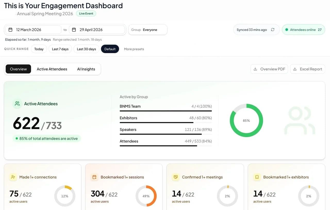
Discover how our new Engagement Dashboard transforms raw event data into actionable insights.
In today's fast-paced world, data is everywhere. But old or raw data, without context or analysis, can be overwhelming. That's why we're thrilled to introduce our latest innovation: the Engagement Dashboard. This powerful new tool isn't just a collection of tables and charts; it's a meticulously crafted portal designed to transform event and community data into actionable insights, empowering us to make smarter decisions.
Why We Built It
The idea for the Engagement Dashboard was born out of a clear need: to provide a real time, on demand, unified view of event or community engagement that clients could use whenever they wanted rather than waiting for end of event or quarterly reports we provided.
We also recognised that we were spending hours manually compiling reports.
Our vision was to create a solution that would:
- Provide a single source of truth for key metrics.
- Enable on demand delivery of the key measures of engagement.
- Simplify data interpretation for all stakeholders, regardless of their technical expertise.
Bringing Data to Life
The journey to create the Engagement Dashboard was an effort, driven by a passion for data and a commitment to user-centric design. Here's a glimpse into our AI powered development process:
1. Understanding Needs
We started by talking with our key customers and experienced associates to understand their challenges and desired outcomes. We gathered invaluable feedback that shaped the dashboard's features and layout.
2. Data Integration and Transformation
One of the biggest hurdles was integration and connecting with real time data. We worked hard to clean, transform, and normalise this data, ensuring it delivered the engagement stats event the event app platform itself cannot deliver.
3. Design and Visualisation
We believe that data visualisation should be both insightful and intuitive. Our design philosophy focused on clarity, simplicity, and immediate readability.. We carefully selected chart types, color palettes, and interactive elements to ensure that information is presented in the most impactful way, allowing users to quickly grasp complex relationships and dive deeper into specific areas of interest.
4. Iteration and Refinement
The Dashboard isn't a static product; it's a living tool that will continue to evolve. We adopted an agile development approach, continuously gathering feedback and iterating on features to ensure it consistently meets the evolving needs of our users.Key Features of the DashboardThe Dashboard is packed with features designed to empower:
- Real-time performance metrics including most engaged attendees.
- Deep interaction metrics like number of questions asked and polls submitted.
- Customisable views and filters to focus on what matters most to you.
- AI powered insights created based on the event or community data
Conclusion
The Dashboard represents a significant step forward in our commitment to make event and community data more accessible and relevant. We're incredibly proud of what we've created and are excited to see how it increases the understanding of the data.
Continue the journey
Find Your Event Setup
Answer a few quick questions and get a tailored recommendation for the right mix of event tech, production support, and post-event community planning.